背景
background–color
语法
/**selector  背景元素的原则去*/ /** color  背景颜色的值, 可以是 颜色名称、十六进制值、RGB、RGBA*/ selector { background-color: color;
}
示例
/** 设置body标签背景为白色 */ body { background-color: white;
} /**设置h1标签背景为红色*/ h1 { background-color: #ff0000;
} /**设置p元素背景颜色为黄色*/ p { background-color: rgb(255, 255, 0);
} /**设置背景颜色为半透明的蓝色*/ div { background-color: rgba(0, 0, 255, 0.5);
}
background-image
背景图片;该属性可以通过图片路径引用一张外部图片。图片路径可以是相对论路径、绝对路径也可以是网络当中图片,支持HTTP协议。
语法
/**selector  表示选择器*/ /**url 图片路径*/ /**相对路径是书写位置到图片位置的相对路径
*/ selector { background-image: url(url);
}
示例
创建一个网页, 使得body、h1、div 拥有不同的背景图片。
<!DOCTYPE html>
<html lang=\"en\">
  <head>
    <meta charset=\"UTF-8\" />
    <meta name=\"viewport\" content=\"width=device-width, initial-scale=1.0\" />
    <title>背景图片演示</title>
    <style> /**相对路径, images目录下必须要有 background-body.jpg 图片*/ body { background-image: url(\"images/background-body.jpg\");
      } /**引用网络当中的图片*/ h1 { width: 100px; height: 100px; background-image: url(\"https://pic4.zhimg.com/v2-bbddbb4b7769475ccb591cc39106b146_r.jpg?source=1940ef5c\");
      } /**使用 linear-gradient 渐变函数*/ div { width: 100px; height: 100px; background-image: linear-gradient(to right, red, orange, yellow);
      }
    </style>
  </head>
  <body>
    <h1></h1>
    <div></div>
  </body>
</html>
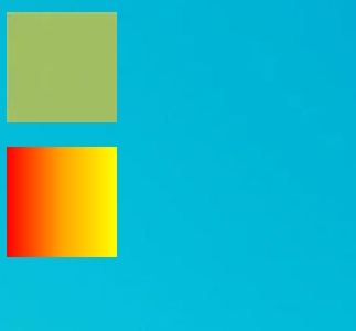
线性渐变
background-image属性可以使用 linear-gradient()形式创建线性渐变背景。
background-image: linear-gradient(to right, blue, red)
                                    渐变方向 开始颜色 结束颜色 #渐变方向也可以用度数表示 background-image:  linear-gradient(45deg, blue, red) #可以有多个颜色值 background-image: linear-gradient(to right, blue, yellow 20%, red)
																										表示中间色
linear-gradient 的详细用法可以参考 地址:https://developer.mozilla.org/zh-CN/docs/Web/CSS/gradient/linear-gradient
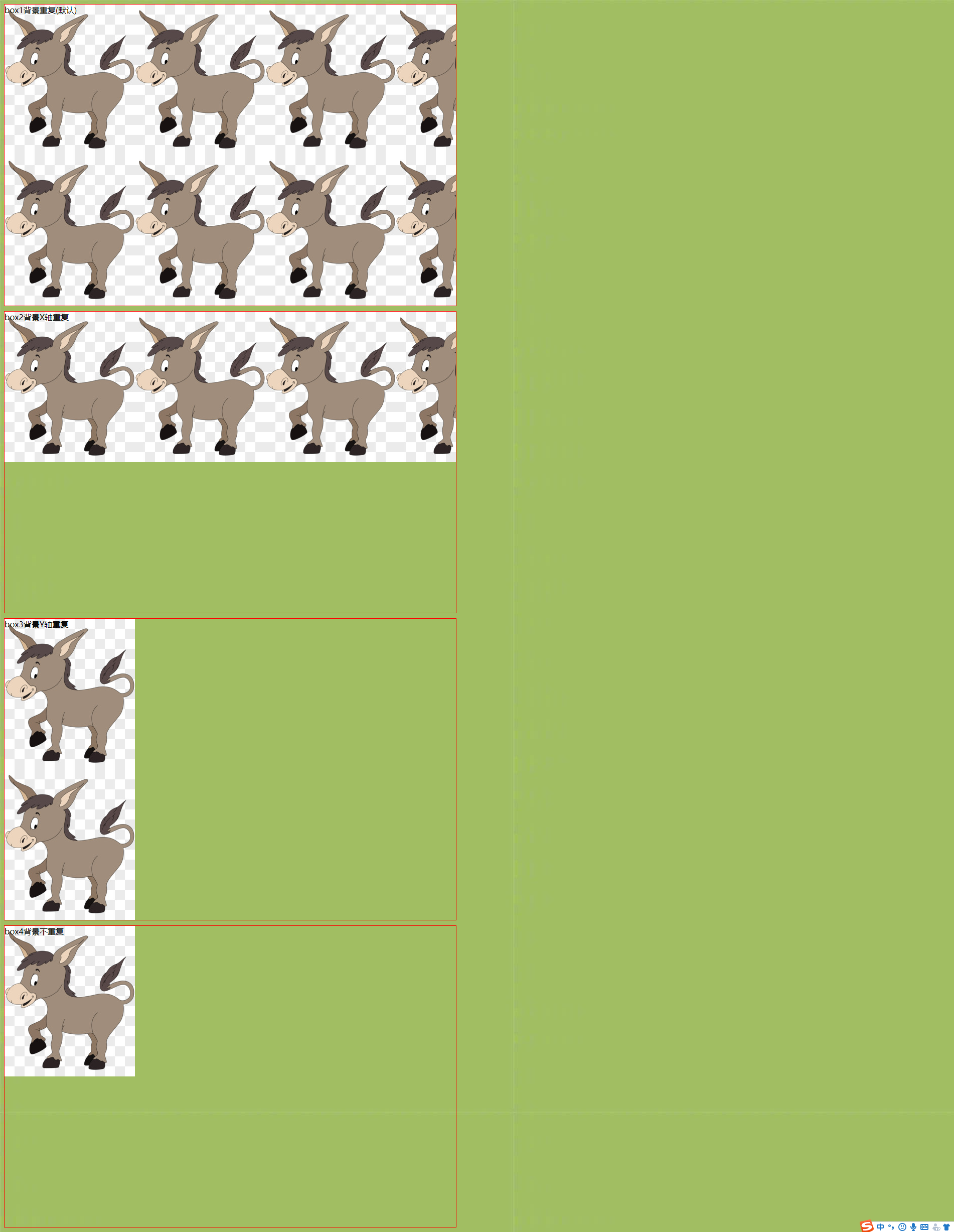
backgroud-repeat 重复方式
background-repeat 属性用来设置背景的重复模式。
| 值 | 意义 |
|---|---|
| repeat; | x、y均平铺(默认) |
| repeat-x; | x平铺 |
| repeat-y; | y平铺 |
| no-repeat; | 不平铺 |
示例
<!DOCTYPE html>
<html lang=\"en\">
  <head>
    <meta charset=\"UTF-8\" />
    <meta http-equiv=\"X-UA-Compatible\" content=\"IE=edge\" />
    <meta name=\"viewport\" content=\"width=device-width, initial-scale=1.0\" />
    <title>背景是否重复背景展示</title>
    <style> div { border: 1px solid red; width: 900px; height: 600px; margin-bottom: 10px; background: transparent url(https://ts1.cn.mm.bing.net/th/id/R-C.2fb5b20787d386d13c553acd9195367b?rik=SVaO4tCMUb4Wrw&riu=http%3a%2f%2fpic.616pic.com%2fys_img%2f00%2f18%2f72%2fVSjXnSgVHI.jpg&ehk=IeIi2DES5PyvRSxSW1k74c0befZUHhZdHWklbVTPQXM%3d&risl=&pid=ImgRaw&r=0);
      } .box1 { background-repeat: repeat;
      } .box2 { background-repeat: repeat-x;
      } .box3 { background-repeat: repeat-y;
      } .box4 { background-repeat: no-repeat;
      } body { background-image: url(https://pic4.zhimg.com/v2-bbddbb4b7769475ccb591cc39106b146_r.jpg?source=1940ef5c);
      }
    </style>
  </head>
  <body>
    <div class=\"box1\">box1背景重复(默认)</div>
    <div class=\"box2\">box2背景X轴重复</div>
    <div class=\"box3\">box3背景Y轴重复</div>
    <div class=\"box4\">box4背景不重复</div>
  </body>
</html>
background-size 背景尺寸
- background-size 属性用来设置 背景图片的尺寸,兼容到IE9。
- background-size 的值可以用像素表示,也可以用百分比表示,表示为盒子宽、高的百分之多少。
- 需要等比例的值,用auto代替。
- contain 特殊值, 背景智能改变尺寸以容纳到盒子里, 可能背景会出现空白区域。
- cover 特殊值, 将背景图片智能改变尺寸以撑满盒子。
/* 设置一个值, 此时代表的是背景图片的宽度,高度默认auto*/ background-size: 50%; background-size: 3.2em; background-size: 12px; background-size: auto; /* 第一个值设置宽度,第二个值设置高度 */ background-size: 50% auto; background-size: 3em 25%; background-size: auto 6px; background-size: auto auto;
示例
<!DOCTYPE html>
<html lang=\"en\">
  <head>
    <meta charset=\"UTF-8\" />
    <meta http-equiv=\"X-UA-Compatible\" content=\"IE=edge\" />
    <meta name=\"viewport\" content=\"width=device-width, initial-scale=1.0\" />
    <title>背景大小设置</title>
    <style> /* background-size 使用 auth */ .box1 { width: 500px; height: 300px; border: 1px solid #000; background-image: url(https://ts1.cn.mm.bing.net/th/id/R-C.2fb5b20787d386d13c553acd9195367b?rik=SVaO4tCMUb4Wrw&riu=http%3a%2f%2fpic.616pic.com%2fys_img%2f00%2f18%2f72%2fVSjXnSgVHI.jpg&ehk=IeIi2DES5PyvRSxSW1k74c0befZUHhZdHWklbVTPQXM%3d&risl=&pid=ImgRaw&r=0); background-size: 300px auto; margin-bottom: 10px;
      } /* background-size 使用百分比 */ .box2 { width: 500px; height: 300px; border: 1px solid #000; background-image: url(https://ts1.cn.mm.bing.net/th/id/R-C.2fb5b20787d386d13c553acd9195367b?rik=SVaO4tCMUb4Wrw&riu=http%3a%2f%2fpic.616pic.com%2fys_img%2f00%2f18%2f72%2fVSjXnSgVHI.jpg&ehk=IeIi2DES5PyvRSxSW1k74c0befZUHhZdHWklbVTPQXM%3d&risl=&pid=ImgRaw&r=0); background-size: 50% 50%; margin-bottom: 10px;
      } /* background-size 使用 contain 智能背景图片尺寸,以容纳到盒子里 */ .box3 { width: 400px; height: 300px; border: 1px solid #000; background-image: url(https://ts1.cn.mm.bing.net/th/id/R-C.2fb5b20787d386d13c553acd9195367b?rik=SVaO4tCMUb4Wrw&riu=http%3a%2f%2fpic.616pic.com%2fys_img%2f00%2f18%2f72%2fVSjXnSgVHI.jpg&ehk=IeIi2DES5PyvRSxSW1k74c0befZUHhZdHWklbVTPQXM%3d&risl=&pid=ImgRaw&r=0); background-size: contain; background-repeat: no-repeat; margin-bottom: 10px;
      } /* background-size 使用 cover 智能改变尺寸,以撑满盒子 */ .box4 { width: 400px; height: 300px; border: 1px solid #000; background-image: url(https://ts1.cn.mm.bing.net/th/id/R-C.2fb5b20787d386d13c553acd9195367b?rik=SVaO4tCMUb4Wrw&riu=http%3a%2f%2fpic.616pic.com%2fys_img%2f00%2f18%2f72%2fVSjXnSgVHI.jpg&ehk=IeIi2DES5PyvRSxSW1k74c0befZUHhZdHWklbVTPQXM%3d&risl=&pid=ImgRaw&r=0); background-size: cover; margin-bottom: 10px;
      }
    </style>
  </head>
  <body>
    <div class=\"box1\"></div>
    <div class=\"box2\"></div>
    <div class=\"box3\"></div>
    <div class=\"box4\"></div>
  </body>
</html>
background-clip 背景绘制区域
指定背景的绘制区域。
默认情况下,背景被绘制到元素的边框外沿,但是可以通过background-clip属性来控制背景的绘制区域。
语法
background-clip: border-box | padding-box | content-box;
- border-box: 背景延伸至边框外沿(但是在边框下层), 默认值。
- padding-box: 背景延伸至内边距([padding](https://developer.mozilla.org/zh-CN/docs/Web/CSS/padding))外沿。不会绘制到边框处。
- content-box: 背景被裁剪至内容区(content box)外沿。
示例
三种取值的演示
<!DOCTYPE html>
<html lang=\"en\">
<head>
    <meta charset=\"UTF-8\">
    <meta http-equiv=\"X-UA-Compatible\" content=\"IE=edge\">
    <meta name=\"viewport\" content=\"width=device-width, initial-scale=1.0\">
    <title>控制背景的控制区域</title>
    <style> /* 裁剪到内容区域 */ .box1 { width: 400px; height: 300px; padding: 50px; border: 10px dotted red; background-color: yellow; background-clip: content-box; margin-bottom: 10px;
        } /* 裁剪至边框区域(包含border) */ .box2 { width: 400px; height: 300px; padding: 50px; border: 10px dotted red; background-color: yellow; background-clip: border-box; margin-bottom: 10px;
        } /* 裁剪至pading区域(包含padding) */ .box3 { width: 400px; height: 300px; padding: 50px; border: 10px dotted red; background-color: yellow; background-clip: padding-box;
        }


    </style>
</head>
<body>
    <div class=\"box1\">div1</div>
    <div class=\"box2\">div2</div>
    <div class=\"box3\">div3</div>
</body>
</html>
background-origin 背景图片定位区域
指定背景图片的定位区域。
默认情况下,背景图片的定位区域是元素的 padding box。但是可以使用background-origin属性来控制背景图片的定位区域。
语法
background-origin: border-box | padding-box | content-box;
- border-box:背景图片的摆放以 border 区域为参考, 以边框的左上角外沿为基准。
- padding-box:背景图片的摆放以 padding 区域为参考, 以padding的左上角外沿为基准。
- content-box:背景图片的摆放以 padding 区域为参考,以 padding内真正的内容的外沿为基准。
示例
<!DOCTYPE html>
<html lang=\"en\">
<head>
<meta charset=\"UTF-8\" />
<meta http-equiv=\"X-UA-Compatible\" content=\"IE=edge\" />
<meta name=\"viewport\" content=\"width=device-width, initial-scale=1.0\" />
<title>background-origin 定位起始位置</title>
<style> /* 背景图片/颜色 从 边框开始(包含边框) */ .box1 { height: 400px; width: 300px; background-image: url(https://ts1.cn.mm.bing.net/th/id/R-C.2fb5b20787d386d13c553acd9195367b?rik=SVaO4tCMUb4Wrw&riu=http%3a%2f%2fpic.616pic.com%2fys_img%2f00%2f18%2f72%2fVSjXnSgVHI.jpg&ehk=IeIi2DES5PyvRSxSW1k74c0befZUHhZdHWklbVTPQXM%3d&risl=&pid=ImgRaw&r=0); background-origin: border-box; background-repeat: no-repeat; border: 10px dotted red;
} /* 背景图片/颜色 从 内容开始 (包含内容) */ .box2 { height: 400px; width: 300px; padding: 30px; background-image: url(https://ts1.cn.mm.bing.net/th/id/R-C.2fb5b20787d386d13c553acd9195367b?rik=SVaO4tCMUb4Wrw&riu=http%3a%2f%2fpic.616pic.com%2fys_img%2f00%2f18%2f72%2fVSjXnSgVHI.jpg&ehk=IeIi2DES5PyvRSxSW1k74c0befZUHhZdHWklbVTPQXM%3d&risl=&pid=ImgRaw&r=0); border: 10px dotted red; background-origin: content-box; background-repeat: no-repeat;
} /* 默认 background-origin 是 padding-box
background-origin 从 padding 开始(包含padding区域)
*/ .box3 { height: 400px; width: 300px; padding: 30px; border: 10px dotted red; background-image: url(https://ts1.cn.mm.bing.net/th/id/R-C.2fb5b20787d386d13c553acd9195367b?rik=SVaO4tCMUb4Wrw&riu=http%3a%2f%2fpic.616pic.com%2fys_img%2f00%2f18%2f72%2fVSjXnSgVHI.jpg&ehk=IeIi2DES5PyvRSxSW1k74c0befZUHhZdHWklbVTPQXM%3d&risl=&pid=ImgRaw&r=0); background-repeat: no-repeat; /* background-origin: padding-box; */ background-clip: padding-box;
}
</style>
</head>
<body>
<div class=\"box1\"></div>
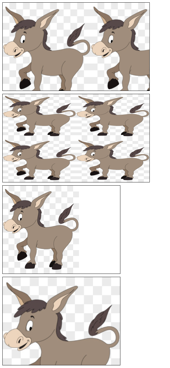
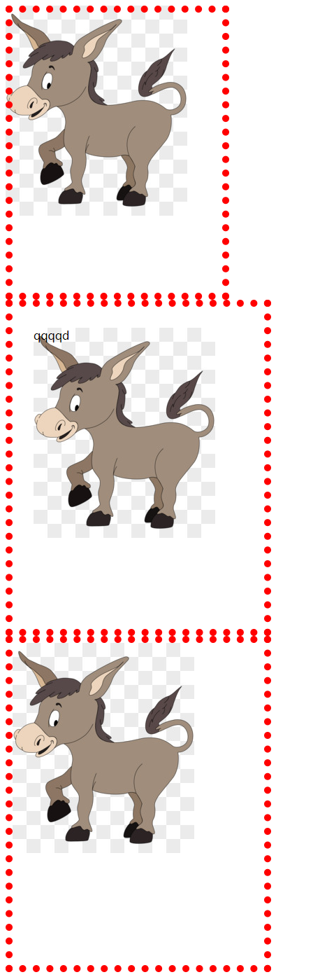
<div class=\"box2\">qqqqd</div>
<div class=\"box3\"></div>
</body>
</html>
background-attachment
background-attachment 决定了背景图像的位置是在视口内固定,或者包含它的区块滚动。
| 值 | 意义 |
|---|---|
| fixed | 背景图像固定在视口中,不随页面滚动而滚动。 |
| local | 背景图像会随着元素内容的滚动而滚动,而不是随页面滚动而滚动。 |
| scroll | 背景图像会随着页面的滚动而滚动(默认)。 |
<!DOCTYPE html> <html lang=\"en\"> <head> <meta charset=\"UTF-8\" /> <meta http-equiv=\"X-UA-Compatible\" content=\"IE=edge\" /> <meta name=\"viewport\" content=\"width=device-width, initial-scale=1.0\" /> <title>背景定位演示</title> <style> body { height: 3000px;
      } .box1 { position: relative; top: 100px; width: 200px; height: 200px; border: 1px solid #000; /* 纵向溢出的内容,用滚动条显示 */ overflow-y: scroll; background-image: url(https://ts1.cn.mm.bing.net/th/id/R-C.2fb5b20787d386d13c553acd9195367b?rik=SVaO4tCMUb4Wrw&riu=http%3a%2f%2fpic.616pic.com%2fys_img%2f00%2f18%2f72%2fVSjXnSgVHI.jpg&ehk=IeIi2DES5PyvRSxSW1k74c0befZUHhZdHWklbVTPQXM%3d&risl=&pid=ImgRaw&r=0); background-attachment: scroll;
      } </style> </head> <body> <div class=\"box1\"> <p>内容1</p> <p>内容1</p> <p>内容1</p> <p>内容1</p> <p>内容1</p> <p>内容1</p> <p>内容1</p> <p>内容1</p> <p>内容1</p> <p>内容1</p> <p>内容1</p> </div> </body> </html>
background-position 图片其实位置
精确设置图像的初始位置。属性值可以使用 px 像素描述,也可以用 top、bottom、center、left、right描述图片的位置。
/**水平方向 在上, 垂直方向 默认为 center*/ background-position: top; /**水平方向 在左, 垂直方向再上 (左上角)*/ background-position: left top; /**定义了 水平位置 25% 垂直位置25%。 左上角 定义为 0%, 右下角定义为 100% 100%*/ background-position: 25% 75%; /**水平位置 10像素 垂直为 10像素 。 左上角定义为 0px 0px*/ background-position: 10px 10px;
示例
<!DOCTYPE html> <html lang=\"en\"> <head> <meta charset=\"UTF-8\" /> <meta http-equiv=\"X-UA-Compatible\" content=\"IE=edge\" /> <meta name=\"viewport\" content=\"width=device-width, initial-scale=1.0\" /> <title>背景图片定位位置</title> <style> .box1 { width: 200px; height: 200px; border: 1px solid black; background-image: url(https://ts1.cn.mm.bing.net/th/id/R-C.2fb5b20787d386d13c553acd9195367b?rik=SVaO4tCMUb4Wrw&riu=http%3a%2f%2fpic.616pic.com%2fys_img%2f00%2f18%2f72%2fVSjXnSgVHI.jpg&ehk=IeIi2DES5PyvRSxSW1k74c0befZUHhZdHWklbVTPQXM%3d&risl=&pid=ImgRaw&r=0); background-size: 50% auto; background-repeat: no-repeat; background-position: 0px 0px;
      } .box2 { width: 200px; height: 200px; border: 1px solid black; background-image: url(https://ts1.cn.mm.bing.net/th/id/R-C.2fb5b20787d386d13c553acd9195367b?rik=SVaO4tCMUb4Wrw&riu=http%3a%2f%2fpic.616pic.com%2fys_img%2f00%2f18%2f72%2fVSjXnSgVHI.jpg&ehk=IeIi2DES5PyvRSxSW1k74c0befZUHhZdHWklbVTPQXM%3d&risl=&pid=ImgRaw&r=0); background-size: 50% auto; background-repeat: no-repeat; background-position: top right;
      } </style> </head> <body> <div class=\"box1\"></div> <div class=\"box2\"></div> </body> </html>
精灵图技术
将多个小图标放在一个图片上,并使用 background-position 技术只显示其中一个。
优点: 减少http请求次数
缺点: 不方便测量,后期改动麻烦
示例
展示精灵图
-
网络中搜索随便搜索一张CSS精灵图https://img-blog.csdnimg.cn/20201101235915402.png?x-oss-process=image/watermark,type_ZmFuZ3poZW5naGVpdGk,shadow_10,text_aHR0cHM6Ly9ibG9nLmNzZG4ubmV0L0xJVUNIVUFOUUkxMjM0NQ==,size_16,color_FFFFFF,t_70#pic_center
-
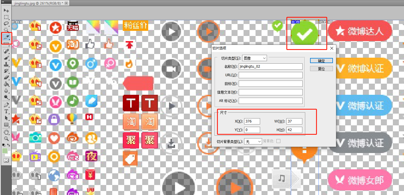
使用 PS 测量图标在图片当中的位置
ps中选择切片工具, 选择需要测量的图片后双击,弹出层终的 x、y表示其在图片中的横纵坐标位置。 w、h分别表示图片的宽度和高度
-
编写代码
指定 background-position: – 376px 0px; (以盒子左上角为原点, 相当于把 图片往左拉动 376 像素,往上拉动 0px )
<!DOCTYPE html> <html lang=\"en\"> <head> <meta charset=\"UTF-8\" /> <meta http-equiv=\"X-UA-Compatible\" content=\"IE=edge\" /> <meta name=\"viewport\" content=\"width=device-width, initial-scale=1.0\" /> <title>css精灵图演示</title> <style> .dui { position: absolute; top: 100px; left: 100px; width: 37px; height: 42px; border: 1px solid #000; background-image: url(images/jinglingtu.jpeg); background-position: -376px 0px;
      } </style> </head> <body> <i class=\"dui\"></i> </body> </html>
background 合写属性
可以使用background属性来同时设置背景颜色、背景图片、背景位置、背景大小等属性。
语法
selector { background: color url(image.jpg) no-repeat center center / cover;
}
示例
例如将背景颜色设置为黄色,背景图片为 01.jpg ,不重复,居中对齐 。
background: yellow url(image/01.jpg) no-repeat center center
            背景颜色   背景图片           背景重复  背景位置

